FlyKnight's
SHADERS
In November of 2023 I made a game called FlyKnight for a friendly gamejam. The gamejam lasted 2 whole weeks and the game was this sort of blend between Shadow Tower Abbyss (a Kings-Fields like) and Dark Souls. It also used old school Runescape-like graphics which is what I want to talk about today.
One of the challenges I set to myself was to make the game without textures and lighting, I thought that it would
help recreate the style better and it was an interesting challenge to tackle.
As always I used Unreal Engine and its rendering method its build with the idea that you will create a pretty realistic game that uses many modern graphic methods, so, by default all materials/shaders in unreal are set up so they have color, specular, roughness,
metalness, emissive and normal map, but I don't want none of that, but before we know what we need, lets:
Review
OSRS
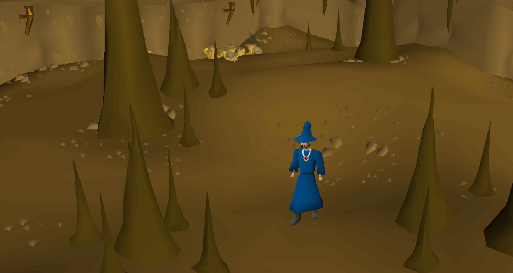
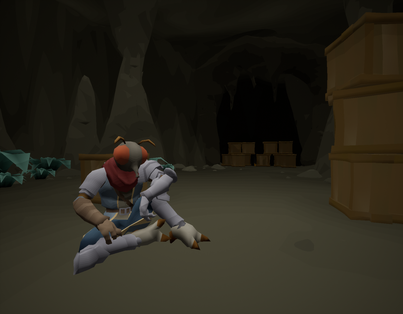
This is a shot of a random cave in Old School Runescape (OSRS), I'm going to list the things I like about it:
- Flat colors
- Everything seems vertex painted, no textures used
- "Steppy style" shading, very visible on the ground, transitioning from dark to light
- Low-poly, stylised
- Sparse use of assets to break monotony like rocks on the ground, mushrooms
Things I don't like:
- Steppy shading not visible on the character
- Lack of depth, all the scene flatly unlit
- A bit stingy in asset/color variety, could use more vegetation for example
On top of this I have some gripes on other areas of the game, if we take a look at Lumbridge for example:
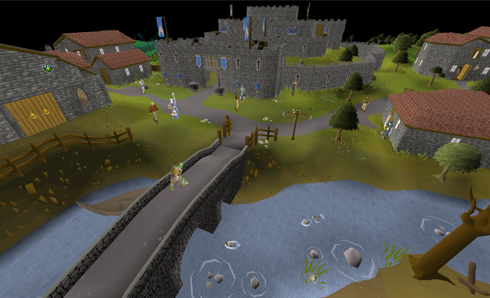
I really dislike the use of textures whenever they are used: the bridge, the castle, the water, the treetops, the rooftops,
I think it's awful!
I understand that the developers didn't feel good about leaving certain surfaces flat or didn't have
the tricount budget to make stylised trees that use more polygons to simulate leafs and branches. But since the game rebooted in 2013 the new areas it has gotten
use mostly flat shaded vertex painted models with no sparse use of polygons when needed which looks very good I think.
So, now that we've reviewed our objectives, let's put things in practise shall we.
IMPLEMENTATION
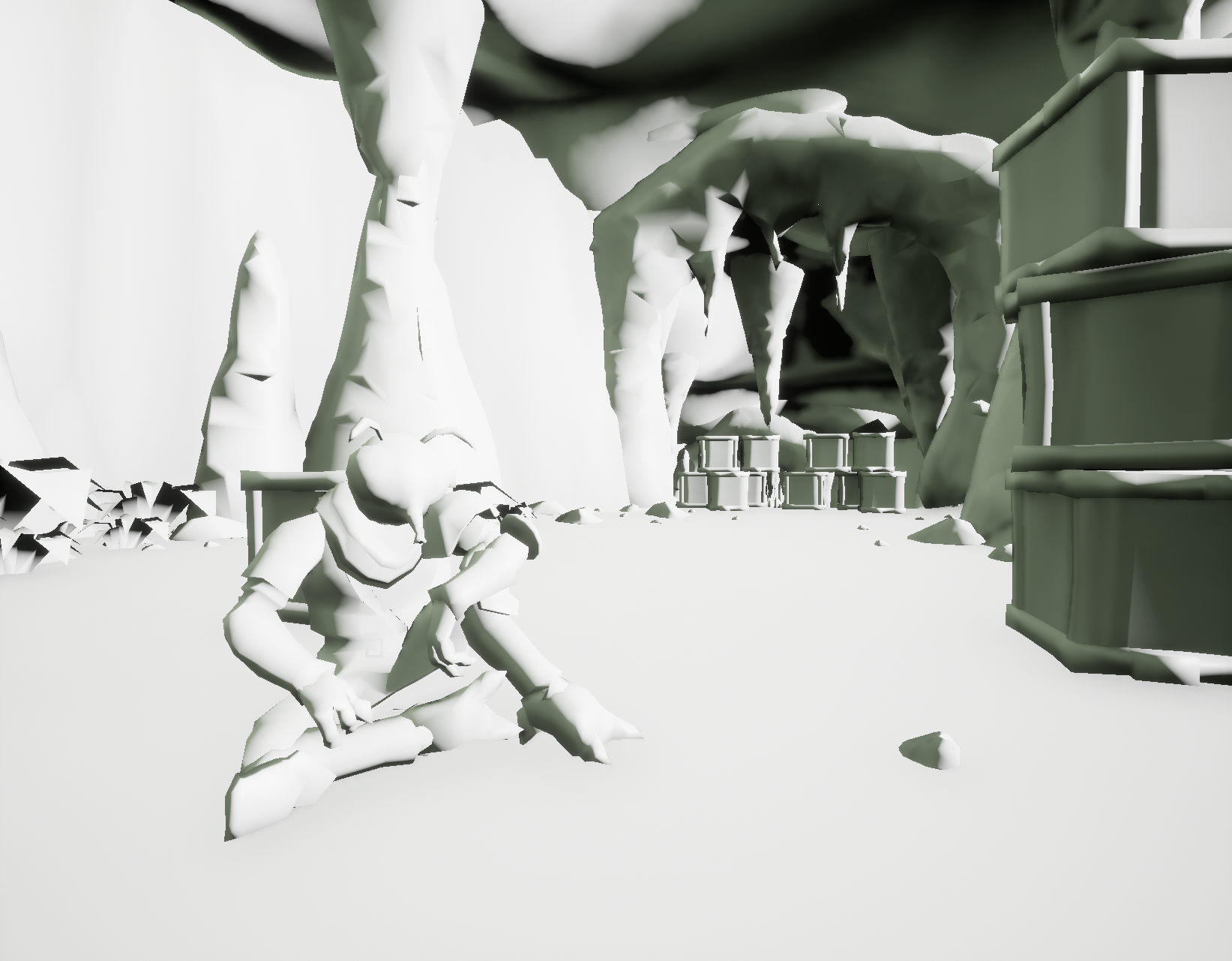
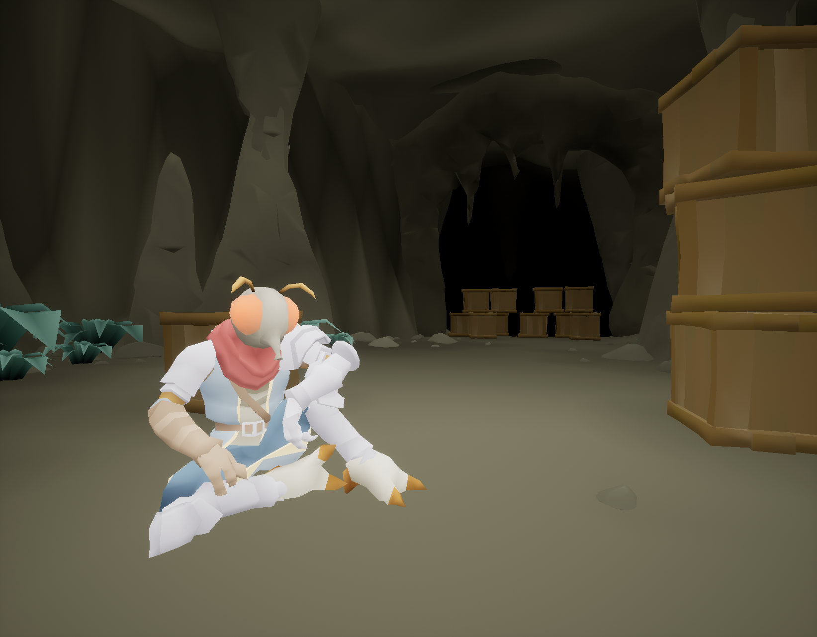
At the moment this is only using a directional and a skylight which I will now delete. And we
proceed with unlit materials that show only vertex colors, which we've painted either in engine or
in Blender.
Don't worry too much about the character using higher values in the color, that's made on purpose
so it stands out later.
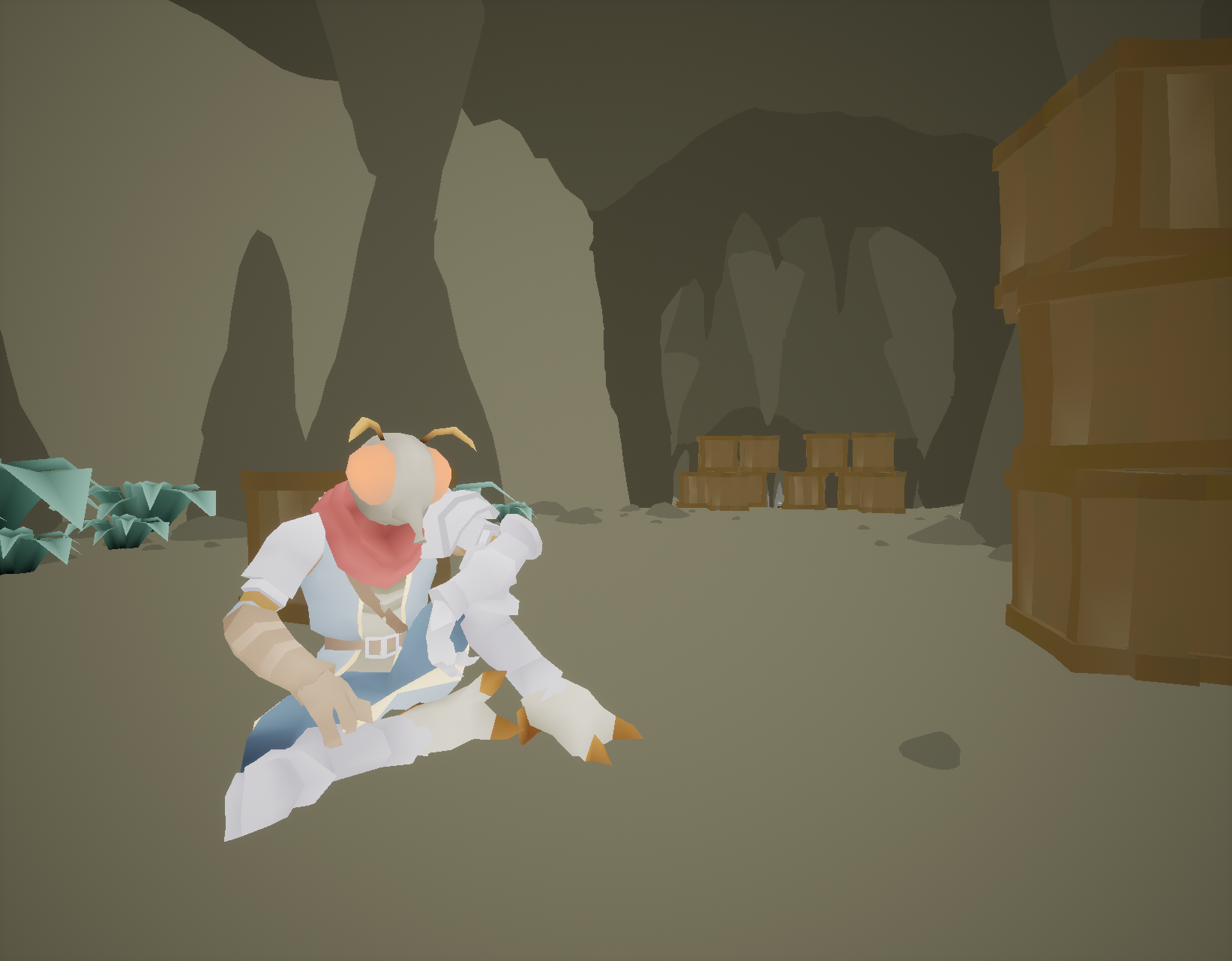
Since we're not using lights or fog, we should address first the problem of Depth Perception, to simulate it we can start by just making a sphere radius area from our camera.
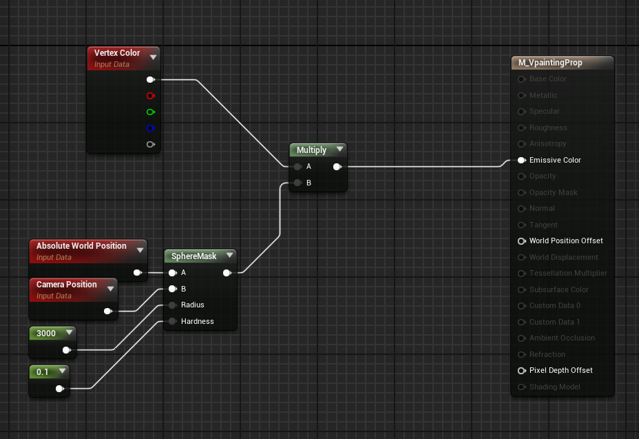
The props still look flat, to bring their shading into the mix we can just get the PixelNormalWS on the Blue channel.
In the following example, I'm lerping it between 0.5,1 to avoid areas of maximum darkness.
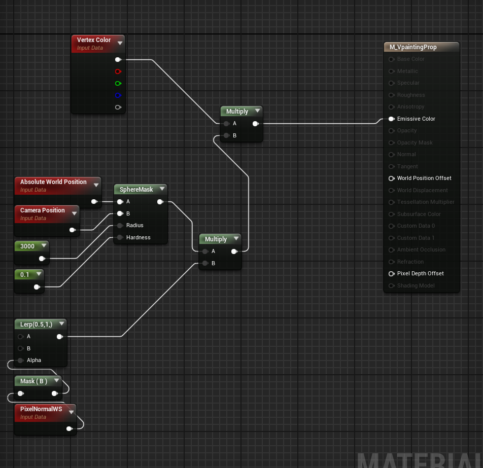
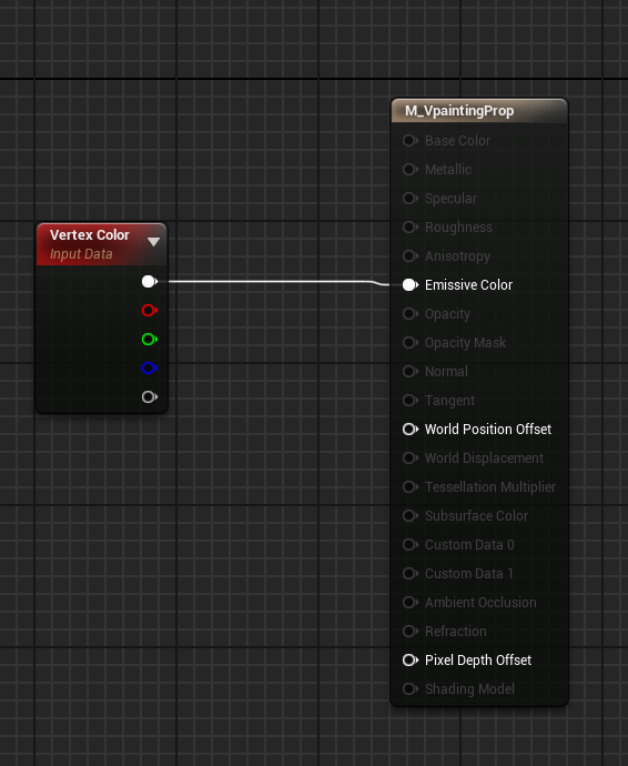
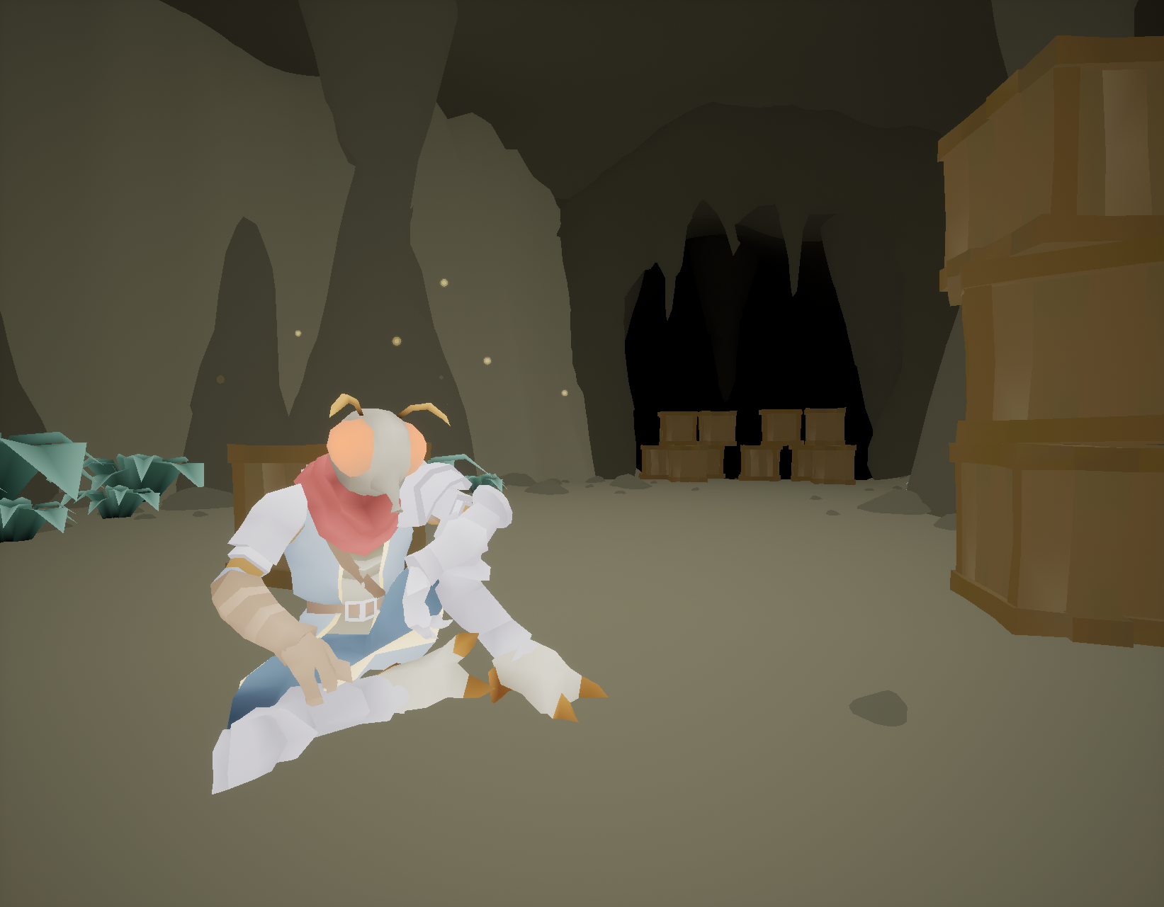
Now for the most important part of the process, the secret sauce, the Steppy style, and it's very simple to achieve, we just need to pass our shading mask through this:
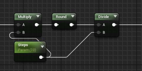
After this you can tweak your mask to your hearts content to get the results you want, I clamped some values and reduced the contrast between the high and low values, and it looks pretty swell.
I recommend you use different shaders for characters, props and environment terrain. I like to have a different shader for characters and lerp
the vertex normal WS info with a vector to simulate that they are shaded from a different angle. Or get the distance field
information in the terrain shader to simulate ambient occlusion, it's very versatile!
I'm aware that some of these things can be achieved with postprocess, but in this project I used Forward shaders, which prevent the use of PP materials, I did this because
I was trying to make a very performant game, didn't quite turn out that way because in 2 weeks I didn't have time to optimise.
Oh well.
Some TIPS
Sometimes, your Steppy Style asset might not be working great, maybe because it has too much or too little shading going on, to illustrate my example:
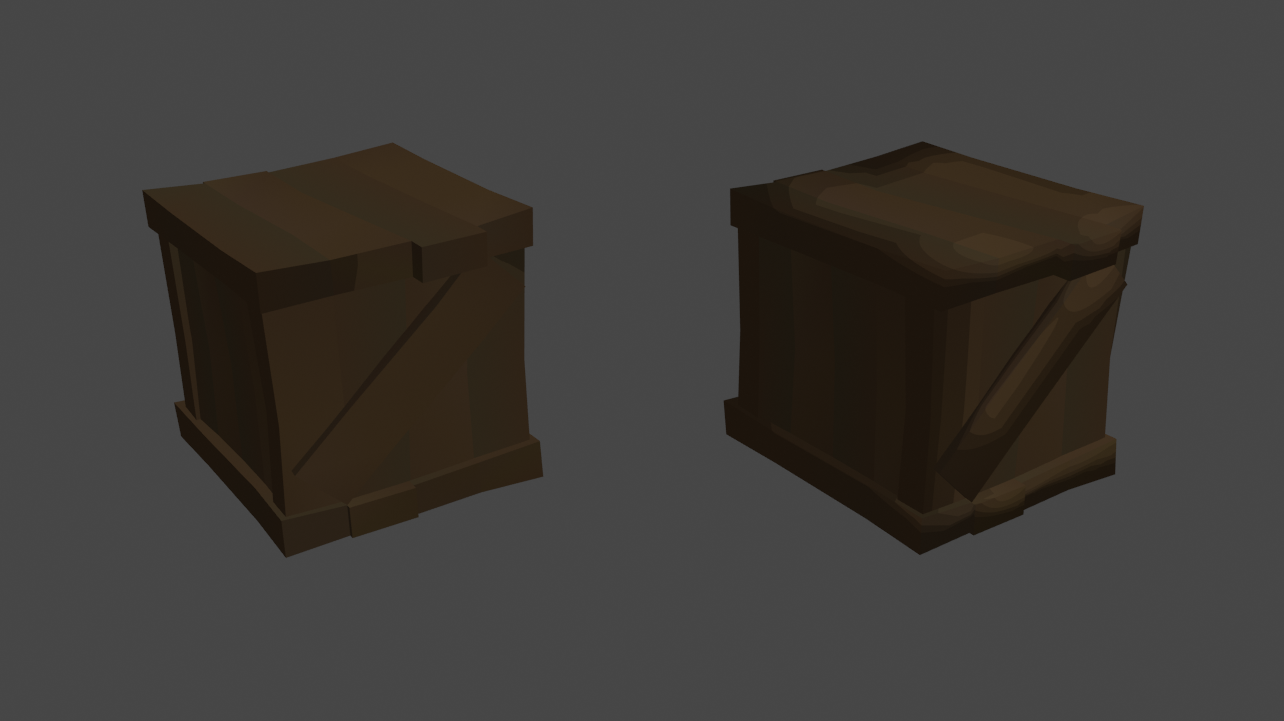
Behold, a crate.
I have recreated the shader in Blender for testing purposes and what you're seeing is a crate that's flat shaded and one that's smooth shaded, like this:
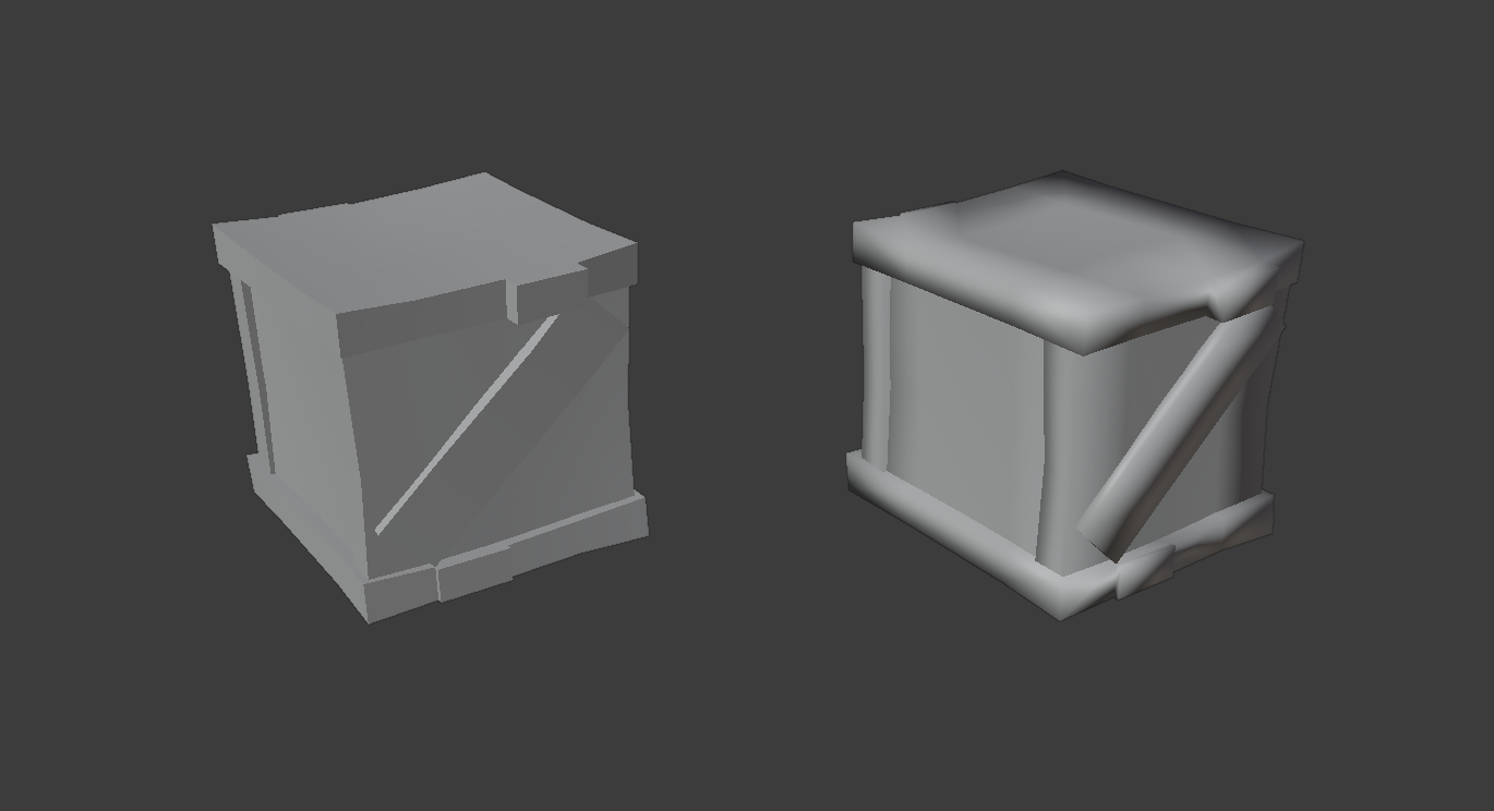
You can probably guess the problem by now, one has no Steppy shader going at all and ther one is too smoothed out, or so I think anyway, so you can play around with normal modifiers to make the shader behave like you want. Here are 3 examples on how to go about that:
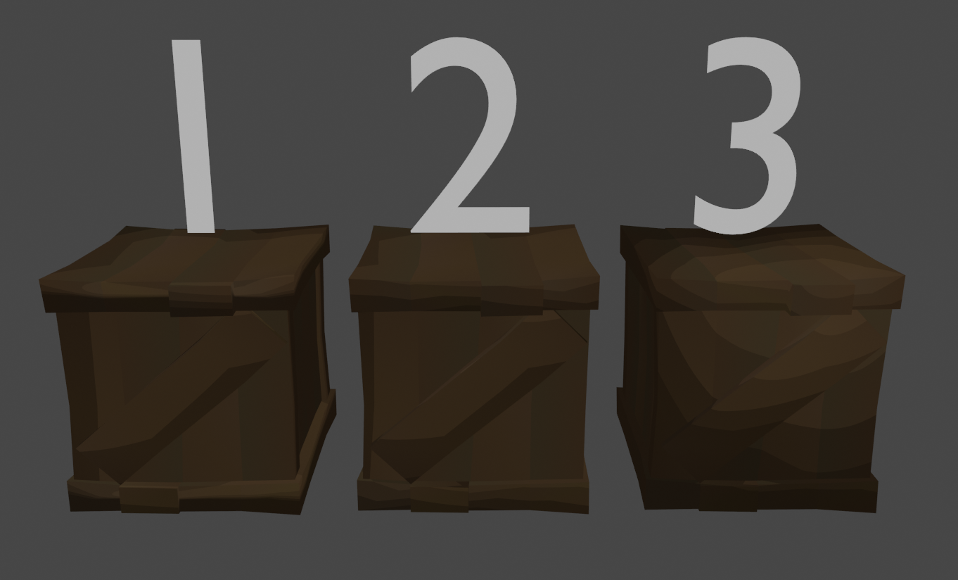
Box 1: Uses the Weighted Normals modifier, it's a handy modifier that tries to make flat surfaces flatter, you can have some control by setting up
face weights, look into it!
Box 2: Looks similar to Box 1 but it's actually using the data transfer modifier with Face Corner Data > Custom Normals activated, and, inside of the crate asset there
is a box object, the idea is that the Data Transfer modifier tries to mimick the normals of a different model, in this case, a box, with the Mix Factor slider you can
influence it.
Box 3: Same deal as Box 2 but the asset it's using to get normals from is a sphere which makes it look forcebly smooth, not saying it's a
good use case but might be handy for some assets sometimes.
Bye bye!
Anyway that's all for this blog, I'll do one in the future talking about the framey animation style and some other stuff too probably. Peace!